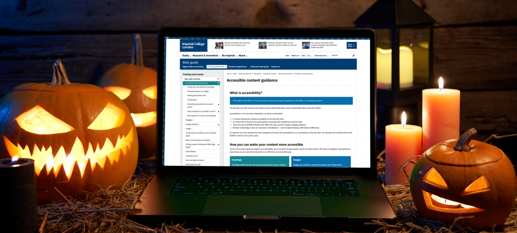
As you may be aware there were some new digital accessibility regulations that came into force last year called the Public Sector Bodies (Websites and Mobile Applications) (No. 2) Accessibility Regulations 2018. These regulations mean that all public sector bodies (including universities) must ensure websites and mobile applications are more accessible.
There is a project being undertaken to ensure the College fulfils its obligations and to identify those websites and applications that don’t meet the College’s standards.
So what are our standards?
At the College we aim to meet WCAG 2.1 standards (level AA). Most of these standards are to do with the way that the content is structured and delivered in terms of the underlying code in the templates and content types. If you are using the College’s centrally supported websites (such as T4), then most of these things are out of your control as an editor. But, there are some things that are in your control such as how you add images, links and other content to your pages.
With Halloween fast-approaching I thought I would ease any fears and share some tricks and treats to show you how easy it is to improve your content.
(more…)
Read Accessibility tricks and treats in full

