As you may be aware there were some new digital accessibility regulations that came into force last year called the Public Sector Bodies (Websites and Mobile Applications) (No. 2) Accessibility Regulations 2018. These regulations mean that all public sector bodies (including universities) must ensure websites and mobile applications are more accessible.
There is a project being undertaken to ensure the College fulfils its obligations and to identify those websites and applications that don’t meet the College’s standards.
So what are our standards?
At the College we aim to meet WCAG 2.1 standards (level AA). Most of these standards are to do with the way that the content is structured and delivered in terms of the underlying code in the templates and content types. If you are using the College’s centrally supported websites (such as T4), then most of these things are out of your control as an editor. But, there are some things that are in your control such as how you add images, links and other content to your pages.
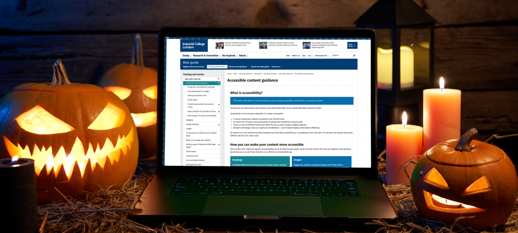
With Halloween fast-approaching I thought I would ease any fears and share some tricks and treats to show you how easy it is to improve your content.
What can I do as a content editor?
Images
Any images that have a purpose on your pages must also be described as text. This means it can be interpreted into other forms such as large print, Braille, speech, symbols or simpler language. Adding alternative (alt) text is straightforward, but does need a bit of thought. Describing what is in the image may not always be enough, because the text must serve an equivalent purpose. This is particularly important with complex images such as charts and infographics.
There is more guidance on alternative text in the web guide, as well as some examples of good practice.
Links
Using links poorly can really hamper someone’s experience of your website and can even make it unusable.
Link text should be clear and descriptive, so that even without context (i.e. surrounding content), its purpose is clear. One thing you really should avoid is using the same link text to go to different places. This is why generic link text like ‘click here’ and ‘here’, are really bad.
Writing clear and effective links is so easy, there are just a few simple rules you have to follow. These rules apply to websites, emails, documents, blogs, wikis and social media. Basically anywhere where you share a link.
We have a full guide on writing descriptive links to show you how.
Tables
The incorrect use of tables is one of the main ways that content can fail accessibility. The primary use of tables is to display tabular data in a logical way. They must not be used to present content such as lists or other content in a certain layout, even if you think it looks better.
Using tables in the wrong way can mean that users of assistive technology, such as screen readers, will not know how the content relates to each other. So they will not get the same experience as a sighted person.
There are numerous ways to present the content instead of using tables, and we have recently added some guidance on using tables.
Documents (including PDFs, Word and PowerPoint)
I see documents all over the place and it is a real mix of the good, the bad and the ugly! I am sure we have all downloaded a document that is unbranded, badly formatted or worst all, using Comic Sans!

My top advice would be to present this content as web pages. The templates on our website are designed to meet brand and accessibility standards. They are also responsive, meaning they are optimised to display on all screen sizes from a phone to a projector. Web pages are also much quicker to update than an uploaded document and easier for people to find using search engines.
We have guidance on how to present documents as web pages.
What if I still need to create a document?
It is still ok to provide documents, but you must try ensure these are as accessible as possible. We have recently added some guidance on creating accessible Microsoft Office documents. Once you have created your documents you should upload these as PDFs as this will make them easier to use and navigate. But, converting a document to a PDF alone will not make it accessible.
Content accessibility checklist
There is a lot to think about when you are creating web pages, so it is easy to fall foul of accessibility and get into bad habits. As a Halloween treat I have put together an accessible content checklist that you can refer to when you’re building your pages in T4.
Further help and guidance
- Accessible content guidance on the web guide
- GOV.UK guidance on understanding new accessibility requirements for public sector bodies
- Public Sector Bodies (Websites and Mobile Applications) (No. 2) Accessibility Regulations 2018
- WebAIM accessibility guidance
I hope this post has shown you that accessibility is not that scary at all. We can all play our part in making our online content a better experience for everyone that visits our websites. If you do have any questions then contact your Faculty Web Officer or send me an email.
