The summer was been a busy period for the Digital team. We have been working with a number of teams to launch new or updated websites in time for the new academic year.
So, as the nights draw in and the temperatures fall, I want to share the good examples I recall.
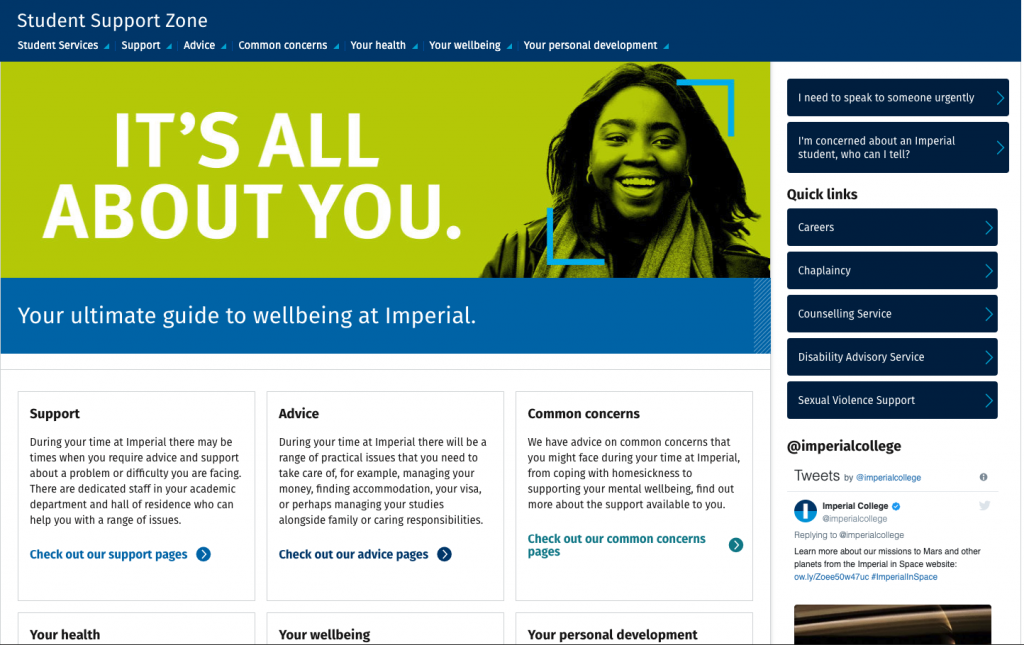
Student Support Zone
I worked with the Student Services team on the new Student Support Zone website. The website provides guidance to students on wellbeing at Imperial, including:
- advice on money, accommodation and visas
- guidance and information on mental health, drugs and alcohol and that all important work/life balance.
The launch of the website is part of a wider campaign and incorporates fantastic design work courtesy of our talented colleagues in the Design and Editorial team.
Create an identity
This is a great example of how you can use great design and content to enforce your brand and messaging. This will make your website stand out and speak to your audiences.
Involve your audience
The team involved students throughout the process. This included:
- brainstorming sessions
- asking them asked them to names the website
- testing the website structure using tree testing to see if they would be able to find content.
I would always recommend involving your audiences to ensure that the your content remains user-focussed. There are a variety of ways you can do this, including surveys, discovery or card sorting workshops and user testing.
Tell people about it
You spend all that time writing amazing copy, finding lovely images and building your pages, but if you don’t tell anyone about it, then they may never see it. We would always recommend having a communications plan, because it will help you reach and inform your audiences.
Student Services will be running a communications campaign targeting all student groups on all campuses and working with departments to embed messaging at a local level.
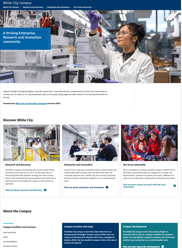
White City Campus
I worked alongside the White City comms group on a redesign of the White City Campus website.
The aim was to focus on the content that is important to the core audiences such as:
- Vision and strategy of the Campus
- Plans for Campus development and construction
- Types of research, enterprise and innovation activities taking place on Campus
- Services and facilities available on Campus and within the surrounding area
- How Imperial works with the local community
- Maps and transport info
- Related news and events
Identifying your audiences
I ran an audit to review the current content and worked with the comms group to identify the audiences and what they come to the website for. This resulted in creating new content that was focussed on audience needs and meant that a number of the old pages could be deleted.
I would always recommended reviewing your content to ensure that it is fit for your audiences. Anything that is not useful should be deleted or archived. One great technique for testing content is to develop some user or job stories.
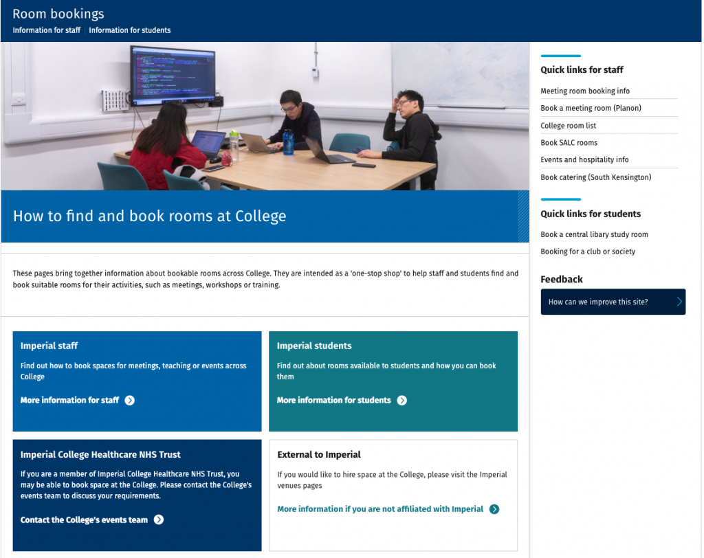
Room bookings
As part of the Space Sharing programme I was asked by the Operational Improvement team to help them create a hub for information about booking rooms. This resulted in the new Room bookings website.
This was as a result of staff feedback; the feedback indicated that the room booking process at Imperial was not clear. The objective was then to have all the information in the same place so the different audiences – staff, students and externals would know how to book spaces.
Testing, testing and more testing
Similar to the Student Support Zone website, the Operational Improvement team involved their audiences throughout the process. They spoke to room booking contacts around the College to gather requirements and understand the different processes for bookings rooms. We used this to map the user journeys and create a structure for the website. This structure was then tested by over 30 members of staff and refined to create the final structure.
And finally…
I hope you found that useful. If you are building a new website or redesigning an existing one, then get in touch with your Faculty Web Officer or contact me for any help or advice.


