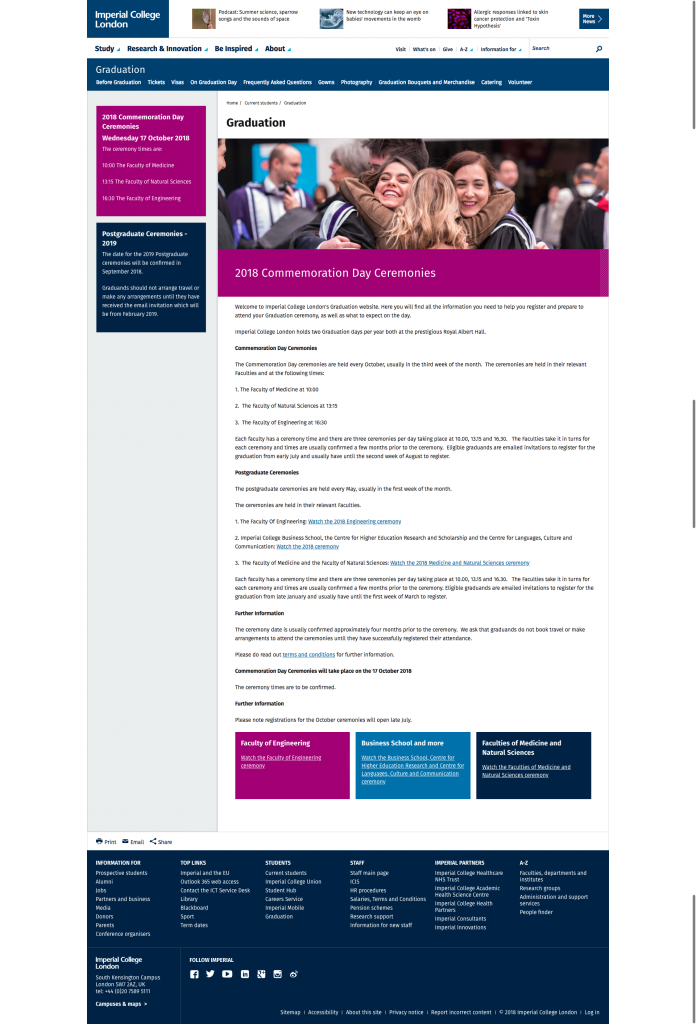
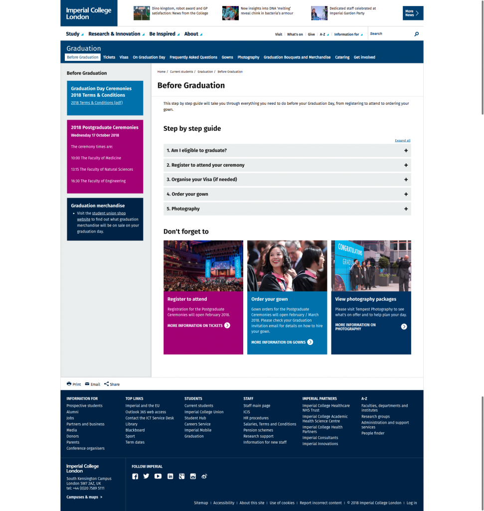
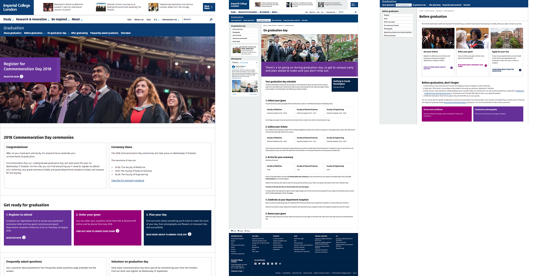
I was approached by the graduation team back in February as they wanted to review and improve the Graduation website for the next Commemoration Day in October.

The process
For this project, I carried out a content audit of the old site and also an analysis of several competitor sites to look at how different universities present graduation information both here in the UK and in the US. Based on this, I made some recommendations for changes to the structure (information architecture) of the website and the design, layout and hierarchy of the content.
Once the postgraduate graduation ceremonies had taken place in May we had a short window in order to make the changes before communications were sent out to the next group of graduands. With the clock ticking Brigid Marriott (Editorial Officer) collaborated with the team to review the text. This resulted in shorter pages and a more consistent and positive tone across the whole website. This approach was also mirrored for the emails to be sent to graduands.
To give you a bit more insight from the other side of this project, I thought it would be great to hear from the owners of this website. I asked Amy Brown (Events Marketing and Communications Coordinator) and Emma Townson (Events Manager, Graduation) about the project:
Why did you want to review the site?
Emma
“The old site wasn’t fit for purpose, it had been built over years, with many different people editing and adding parts to it. It was difficult to navigate and wasn’t doing its job – we would still receive in the region of 50 emails per day as students couldn’t find information on the website. With the new design we were hoping to achieve a positive and informative website and embed the new visual identity for the division.”
Amy
“The number of enquiries the graduation team were receiving on the lead up to graduation day led us to believe that the website wasn’t doing what it was supposed to do. Aside from the overall hodgepodge it had become through many different owners it was becoming very onerous to update and keep updated. Along with this, the general success of the grad guide that gets produced ahead of each graduation day showed us what a difference clear language and structure had in ensuring our graduands knew all the information they needed.”
What steps did you go through to create and review the content?
Emma

“We kept a log of themes, questions and queries that came in so we knew the types of things that weren’t being answered on the website. We also used the Editorial Team to help us get a single tone of voice and streamline the number of words we were using. We also blind tested it, we asked people outside of the team to read through and tell us whether it made sense or not and then refined if it wasn’t right.”
Amy
“It was very much a result of a successful collaboration which started with a general agreement that the previous website was no longer fit for purpose and was rather hindering our ability to communicate information to graduating students with speed and efficiency. From there we looked at what content we did have and considered the questions the graduation team received most frequently. The editorial process was very cathartic as we found a home for all the pieces of information that had previously been a bit hidden away. We had a great deal of editorial support and we saw several versions of the text for the website which we all fed back on according to our different points of view.”
What are the main improvements with the new site?
Emma
“We’ve recorded a 30% reduction in email and telephone enquiries to the team compared to this time last year. Additionally, we’ve seen more traffic to the website and less click through to get to information. Furthermore the layout enables us to be more dynamic with how we share content.”
Amy
“Visually the website is far more appealing to our visitors. It’s a huge advantage to have started afresh as opposed to working on top of an already confused structure. The new structure works harder to ensure that the visitors to the pages can find the answers they are looking for quickly and encourages them to return to the pages in the run up to graduation in the coming weeks. The back office is also far easier to navigate now that we don’t have leftover pieces of content that haven’t been used for many years which speeds up the process of updating the website as a whole. A major improvement is the approach we took in focusing on the next ceremony rather than both ceremonies at a time which could lead to some confusion.”
The new (improved) website
After all the hard work from the team, the new website went live in late July.

What has been the impact so far?
- The number of calls and emails to the graduation team has reduced by 30% compared to last year.
- Unique page views to the Graduation site are up by 28%
- The amount of time users are spending on the pages is down by 71% which means that people are generally finding what they need quicker.
Feeling inspired?
If you want to review and improve your website or pages and need some help, then get in touch with your Faculty Web Officer in the first instance. Or if you have any questions about how to approach a website review then contact me.