Category: Charity Insights 2014

Dissecting Infographics

A series of weekly blog entries inspired by my work at Sense About Science. This week: Infographics.


As a graphics designer I have worked on a range of tasks, from simple ones like making buttons for websites to designing print media for distribution and display. But rarely have I had the chance to bridge my scientific interest with my design hobby. On the one hand, this may be because visual design tends to take a back-seat for scientific media – the focus for design in likes of reports and posters are that of functionality and practicality. But there’s a more raw side to it; as engaging as it is to be perfectionist and pixel-perfect, it’s a rather alien concept to pair the abstraction of design with the concrete nature that are data and facts from scientific discovery.

Those feelings, though, may be increasingly unfounded. While one shouldn’t expect brilliantly illustrated posters or artistically decorated journal articles anytime soon at conferences, initiatives in science communication have raced to take advantage of modern styles and conventions to better captivate their audiences. For instance, at the recent Royal Society’s Summer Exhibition, I was genuinely impressed by the lengths taken by some stalls to create brochures capable of bringing the science to life. Take a look at this excerpt from the material produced by the folks showcasing the Higgs Boson discovery:

Excerpt from "The Higgs Boson and Beyond"
Excerpt from “The Higgs Boson and Beyond”. (CERN and partners) Click image to view original booklet in digital format

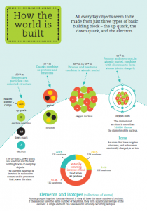
I’ll admit it: aside from astronomy, physics haven’t captured my full interest since GCSE’s. Although I have harbored superficial intrigues as to fields such as particle physics – mainly due to their high research profile at Imperial – I do not understand them. Yet, coming out of reading the guide, I feel more confident about the basic elements. My knowledge has expanded – I know now how quarks fit in with the scales of our world, the foundations of matter/antimatter, and the basic principles of the Higgs Boson and Higgs field. The cartoonish graphics, brightened with a pastel palette, breaks down the highly complex topic into digestible chucks of appeal to a visual learner.

What the content of The Higgs Boson and Beyond illustrates is the increasing power of infographics. In a world increasingly reliant on social media and instant messaging, these hyper-visual ‘sight-bites’ can take advantage of our sharing culture, allowing skilled professionals like scientists to capture key information and data and disseminate it wide and far.

The argument can be made that such a method to communicate science may be ill-conceived. Breaking down science into tiny, digestible chunks may threaten the integrity of the information being communicated, as it wouldn’t present the full dimensions and nuances of scientific texts. Moreover, infographic production can be done by almost anyone, with or without science training. By combining a focus on visuals with a failure to present information appropriately, errorneous and/or exaggerated information can easily be fed to the public and gain great appeal.

Example of what a bad infographic can be - deliberating using visuals to distort the information being presented
Example of what a bad infographic can be – deliberating using visuals to distort the information being presented. (Marketing Technology Blog)

Thankfully, such a phenomenon doesn’t seem to have developed (or at least, isn’t mainstream). It helps that so many science organizations and groups have jumped aboard the ‘infographics bandwagon’ in recent years. The high output of graphics, combined with a general appreciation of science from Internet communities, seem to have kept the flood of visual pseudo-science at bay. It also helps that proper infographics are not something that can be made easily in one’s average word processor, and follows strict guidelines. True infographics are ultimately about the accurate portrayal of data and evidence, not to act as decorations to a document. It stands to reason that accurate infographics require more care and attention, perhaps through commissioning professional designers, who would be more readily able to produce quality products. These, in turn, would sport better aesthetics and hence be more captivating and readily disseminated.

On the other hand, an example of a brilliant science infographic. Note that the visuals not only bring the content to life, but also reflects the science itself with larger virions for greater data and viral coats reflecting that of actual viruses. (Good & Column Five)

Returning to Sense About Science, one of the main challenges during my 4-week internship would be to try and create infographics based on the charity’s Making sense of… guides, for sharing on social media both to regularly inform followers and potentially be used as a promotional tool. Having never made an infographic before, this is proving to be a thrilling yet daunting challenge. The points discussed above would set a basic framework which I trust will inform my work in the weeks ahead. to set down a basic framework which I trust will inform my work in the weeks ahead.

(As of the time of posting, 2 infographics have been drafted for Sense About Science. Once these are approved, they will be posted as part of my Xth Day series)

Next: Tenth Day. Then: Dissecting Pt. 2


Week 4 at the PHG Foundation

I could not believe how quickly my last week at the PHG Foundation arrived, and that it was already time to wrap-up up my project. I spent the beginning of the week implementing the last corrections and feedback for the briefing note, which will be published on the PHG Foundation website. I will be one of the authors on the publication, and before the briefing note can be accessed on the website it will be converted into a very smart format, similar to that of other briefing notes, by the communications team. It will be very exciting to see the final document!

Further to this, I spent the remainder of my week preparing a presentation on the project research findings. In order for everyone to be able to attend, we scheduled the presentation in a few weeks time, so I am already looking forward to coming back to the offices then. It made it much easier to say good-bye to everyone on my last day, seeing as I already knew that I would soon be back again.

My internship at the PHG Foundation has been a truly fantastic opportunity and I whole-heartedly enjoyed the experience of working in such an intellectually stimulating environment. I am extremely grateful to have been given this opportunity and I highly recommend for any future interns to start searching for prospective internships early, and to realise opportunities that come their way.

Part of the PHG Foundation Team in Cambridge

Final week with the British Red Cross GIS team

It is hard to believe that I am writing my final blog post already. At the same time, I am glad with the things I have learnt and implemented in these last few weeks.

I spent the first few days making my first dashboard! The team wanted to know if there was a way to have a timeline which would visualize the spread of incidences on a map. They foresee it to be an important visualization for the recent Ebola outbreaks. So after creating my own fake data set and digging around online, I was able to create this in the first few of days of the week.

Capture

The visualization allows you to choose one or multiple dates and sends the selected data on a map coloring the relevant districts in varying hue depending on the number of incidences. One of the major obstacle for this code was to enable both the selector and the data points (represented by dots) at the same time. After posting the question online on the dc.js usergroup I was able to work out a solution for that.

The rest of the week was spend on documenting all my work on the local Formhub server. I had to create a guide to setting up another server from scratch and a user manual assuming very basic technical knowledge for the server, after its set-up.

I have had a very productive time here at the British Red Cross and this week has really helped me substantiate the things I have learnt and done over the last 4 weeks. The team assured me that they would be keen on having more students from ICL in coming years and I obviously recommend it too!


The end of week three at St. Anne’s

Week three is just about over and it’s probably been my favourite (and the most interesting) week so far. I’ve spent a lot of time designing a leaflet about ARBD for staff I discussed in my last blog post, and a large part of that has been to do my own research on the condition. This involved literature searches and lots of journal articles! The whole point of my project with St. Anne’s was to help raise awareness of the severity and prevalence of ARBD in vulnerable groups, and the lack of resources on this subject really highlighted the need for greater awareness of the condition.

Besides researching ARBD, I’ve also been hard at work screening clients for signs of the condition. By now I’ve got pretty good at the process (I can even perform the screen without the instructions!) and know how to make clients feel comfortable and relaxed. What I’ve really noticed during my time at St. Anne’s is the honesty of the clients – they are very open about any worries they may have about their memory and their alcohol/drug use. It’s something I’ve come to really admire, and it should make my data much more reliable.

So with just one more week to go, I’m getting ready to analyse the data I’ve collected and give the staff at St. Anne’s my resources on ARBD. I’m already sad to leave and my project is not even finished yet!

Hard at work researching!

First Week at Barnardo’s

So I started my work with Barnardo’s on Monday. The first two days involved carrying out health and safety requirements not just regarding myself but also regarding children/carers who will quite often be present in the building.
Today is Wednesday and I have started one of my projects involving the organisation of folders both on hard copy and digital copy. The project demands that the organisation of the folders be carried out within the digital server. Hence this will involve uploading hard copies onto the Barnardo’s server to complete a full backup of all details of Carers in the last 30 years. This project is something that this branch of Barnardo’s considers to be very useful and is also a task that has been allocated to be completed for over 15 years. Finally someone has got round to it!
It is still early days but I feel like I am settling in very well. The atmoshere is fantastic and the people are wonderful. The colleagues working in my office are very welcoming which is allowing me to settle in faster than I expected. We also have also had a couple of conversations regarding the not for profit sector and hope to have several more in the future.

Final week with CWT

My fourth and final week working with Cornwall Wildlife Trust is drawing to a close. Another week of good progress and I have just about completed all of the work for the project. I‘ve not yet finished a write-up of all of the work I’ve done, to present to the Trust, so I’ve volunteered to continue working on the report and submit it to the Trust once it’s complete.

Two more of the installation quotes were delivered this week, brining the total up to three from the four consultations, but one is still yet to arrive. I set about going through the details of each, as although the same items were discussed at each consultation the proposals from each company are different. The assumptions and approximations made by each consultant are different, and so too are the details of what is included in each quote, and what is not. Because of this care needs to be taken when comparing between them to draw conclusions.

The key themes of my work this week were the financial aspects off an installation. With more quotes delivered I could begin to compare the various estimated costs, and with their estimates of annual energy requirements I could repeat earlier calculations to offer a range of figures; using the variation to create a band within which the actual values will lie. The progression of the study from background and motivation; through potential renewable installations; then fuel options, and also fuel production; to finish with a cost-benefit analysis of the findings has fitted well with a short summer internship.

It’s been a highly interesting experience, to investigate the feasibility of renewable energy installations, and I have certainly gained a lot of knowledge regarding the industry, and some experience of working with the people involved. I would highly recommend the scheme, and Cornwall Wildlife Trust, to future students and I’m glad that I have had the opportunity to undertake this project.

Week 3 at the PHG Foundation

Week three has been very busy, energetic and time to get things done. Primarily this included reviewing and acting on the comments and feedback I received, by looking into further resources and carefully analysing and interpreting the evidence surrounding the potential use of circulating tumour DNA in the clinic. Some of the resources I have consulted whilst researching and writing the policy briefing have included academic papers, the NICE guidelines, resources from learned-societies and medical/science news-feeds.

One of the most exciting parts of the internship has been the ‘horizon-scanning’ activities, where I am learning about all the fascinating advances that are being made at the forefront of science. I am also finding it very stimulating to conceptualise my own strategies for the implementation of this new technology for cancer testing. At the end of the week I had a meeting with the Chair of the PHG Foundation and had the chance to discuss my project findings. Further to that, there have been many more interesting conversations in the office and I continue to learn how science policy really works in practice.

Week 2 at RECLAIM

It is the start of the summer programme at RECLAIM and there are some exciting trips organised for all the young people. Yesterday we went bowling and I took the opportunity to talk to some of them about their experience on RECLAIM to gather some information for my evaluation. Most of them were intelligent and engaging and were keen to give me some useful information but as you can imagine it is sometimes difficult to get 14 year olds to fill out a boring questionnaire or something similar! However I did get some interesting points and put them together in the first part of my evaluation and we had a fun afternoon bowling!

Focus Group
Focus Group

Over the next week I will be conducting another focus group and helping out with some of the other activities on the summer program. I also aim to do some one on one sessions in order to produce a case study on one or two of the young people I have met as part of my evaluation.

Generally my time at RECLAIM has been positive so far. It is so small there is only about 6 or 7 people in the office in one day but everyone has a really good attitude and is completely dedicated to the charity. It has a relaxed friendly atmosphere, some of the young people from the projects also pop in to say hi from time to time.

First Day

It seems like an eternity since I was first awarded the Charity Insights bursary. I have this vague memory that the good news was almost immediately overshadowed by some of the biggest and most important exams I have had to take to-date, then by my July internship with Imperial’s Comms office. But, hey, given all the exciting news from my fellow interns elsewhere, it’s better that I wasn’t too late to the party!

In a way, doing an internship at Imperial right before Sense About Science has left me feeling very prepared. While the former gave insight into how science news is generated, and how Imperial engages the public on its research, working with Sense About Science will hopefully show me the other side of the story: What happens to science news after it’s been published? How is science presented to the public? How can we make sure the information presented is digested and absorbed in a suitable manner?

The internship started off deceptively gently (minus an Underground delay snafu; thankfully I had left a bit earlier!). There was lots of orientating myself with the office, and quite a few new faces and names to learn! (I admit, I spent at least a few minutes after the intro’s looking up everyone’s profile on the website and making sure all the names were embedded in my mind…) But within an hour, things were already hands-on as I went straight into creating a dissemination plan for Sense About Science’s upcoming publication: Making sense of allergies.

A dissemination plan is essentially a database of all the people and organizations that Sense About Science is to contact, in order to ensure the published guide gets to the hands of as many people as possible. But it’s not just a case of searching ‘allergies’ and writing down every result on the first page – in order for a dissemination list to be effective, it needs to pinpoint the specific individuals within the organizations, logging down their names, phone numbers, email addresses, notes of interest etc. Some other important questions also come into mind:

  • Is the organization worthwhile contacting? It’s surprising how many promising results lead to organizations that are defunct or have been inactive for eons. Maybe watch out for ‘bad science’ items as well? Some of the results I’ve came across is best described as ‘shady’
  • Who best to contact? Most groups tend to show a generic email/number and make you dig for more specific contacts. On the other hand, some e.g. research centres only show the most senior members. Networking 101 made apparent today: always try to find the comms or press team! If the contact is too junior/generic, a response might never be had (and an argument could be made that it comes off as unprofessional). But, if the contact is too senior, a response might also never be had…
  • Is a network/relationship already in place? It’s unbelievable how vast their science network is! Lots of cross-checking is to be had to make sure there isn’t already an established person in-place who would be the preferred point-of-contact

When it comes down to it, the task can get a bit dull especially when you’ve been working at it for hours -definitely should consider a bit of better time management over the next few weeks, maybe alternating tasks for added variety! That said, no dissemination plan = no outreach = lots of carefully written & designed booklets sitting in boxes = lots of resources wasted = nobody benefits. Plenty of motivation right there to do it well.

Looking at the week ahead, I expect to dedicate quite a bit of time on creating an exhaustive catalogue of the clinics and research groups relating to allergies. But I’ll also be starting work on summarizing Sense About Science’s publications into light-weight info-packs which can be easily distributed virtually, and helping out with social media by (at long last!) creating infographics! More on the horizon too; this is just the beginning.

Next time: Dissecting Infographics. Then: Tenth Day


Week 3 at the MS Trust

I have now completed my third week at the MS Trust and I am pleasantly surprised at how much I have learnt in what has been a relatively short amount of time. My literature search has continued and I have covered a wide range of health interventions for people with MS (PwMS). I have looked into quality of life amongst PwMS, specifically looking at how MS can affect people’s careers, movement, and the economic burden it may have.

Many PwMS find that their mobility decreases over time, which may lead to them becoming wheelchair-, or even bed-bound. Such drastic changes in lifestyle can cause a multitude of problems; from pressure sores, contractures (where a muscle becomes permanently shortened), deconditioning, and even muscle atrophy; immobility can affect much more than a person’s ability to get from A to B. I spent some time this week reading about such issues, and searching for any literature that had been produced looking specifically at MS and similar issues.

Reading about how MS can affect people is one thing, but seeing it in person makes it a lot more real and emotive. This week I was able to spend some more time at the local MS Therapy centre, where I spoke with patients facing the same problems I had spent my time researching. Many had mobility and balance problems, and were struggling with the hot temperatures we have been experiencing this summer. I have learnt that such difficulties with heat are not uncommon in MS patients – many patients find their symptoms considerably worse during hot weather – an occurrence known as Uhthoff’s phenomenon. Fortunately the treatment room in the therapy centre is air conditioned, which made the patients feel a lot better. But sadly some were so adversely effected by the heat they were unable to make the journey to the centre.

Currently PwMS are only entitled to six sessions of physiotherapy every two years on the NHS, and many find that this short amount of time isn’t enough to make a positive difference. The local MS therapy centre aims to address this by providing affordable physiotherapy sessions to MS patients from all nearby regions. But not only do the therapists help to treat PwMS, they are now also working with stroke patients. I spent some time on Thursday with these stroke patients, and saw how much help the physiotherapists are able to give.

My supervisor, who is in charge of producing the toolkit I am helping to collect evidence for, is a physiotherapist specialising in working with PwMS. I will be spending some time next week at her clinic in Norwich, which I am really looking forward to.

Picture to come soon…