Category: Jay Shah

Final week with the British Red Cross GIS team

It is hard to believe that I am writing my final blog post already. At the same time, I am glad with the things I have learnt and implemented in these last few weeks.

I spent the first few days making my first dashboard! The team wanted to know if there was a way to have a timeline which would visualize the spread of incidences on a map. They foresee it to be an important visualization for the recent Ebola outbreaks. So after creating my own fake data set and digging around online, I was able to create this in the first few of days of the week.

Capture

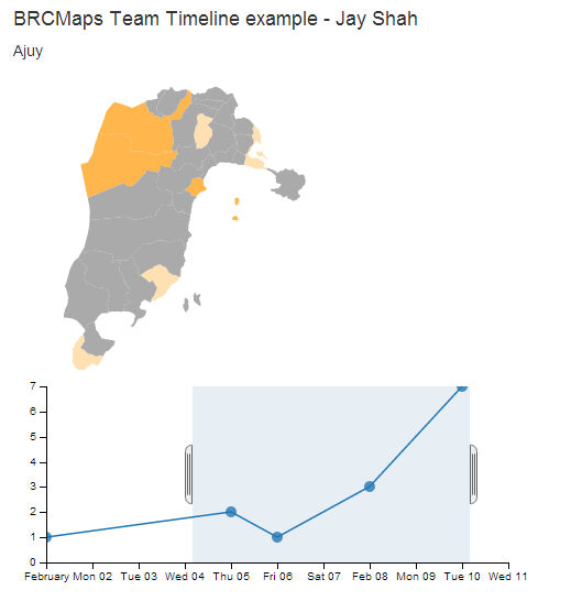
The visualization allows you to choose one or multiple dates and sends the selected data on a map coloring the relevant districts in varying hue depending on the number of incidences. One of the major obstacle for this code was to enable both the selector and the data points (represented by dots) at the same time. After posting the question online on the dc.js usergroup I was able to work out a solution for that.

The rest of the week was spend on documenting all my work on the local Formhub server. I had to create a guide to setting up another server from scratch and a user manual assuming very basic technical knowledge for the server, after its set-up.

I have had a very productive time here at the British Red Cross and this week has really helped me substantiate the things I have learnt and done over the last 4 weeks. The team assured me that they would be keen on having more students from ICL in coming years and I obviously recommend it too!


Week 3: Finalising that server and practicing crossfilter.js and dc.js

In last week’s blog I mentioned that final hurdle for the offline server was to get to the bottom of the disappointingly slow speeds. It took a few days to research around this since no support was found for it on-line. This was not surprising given the specificity of the case and the relatively new service.  That being said, this solution is an exciting prospect for charities such as the Red Cross. In fact, my team had discussed the capability of Formhub with the Medecins sans frontieres (MSF) and the MSF immediately put out a request to developers to get this working- it would enable them to digitally collect data in remote and rural areas making the current process a lot more efficient and scalable.

Luckily, learning about web programming in the previous weeks meant I was familiar with Google Chrome’s Developer tools (press Ctrl+Shift+I on Chrome to check them out). This meant I could load up the server and inspect the cause of the delay. It turned out that since Formhub was not originally designed to be used in such a way; the javascript libraries  (eg bootstrap, jquery etc)  were called upon via the web. I therefore narrowed down the code using these libraries, SSHed into the server, downloaded the libraries in a local storage location and called upon them from within the server . Voila! The server was now running at great speeds.

For rest of the week, I continued to learn about creating interactive dashboards primarily using this tutorial. So I can now make basic line charts linked with pie-charts and so on.

blog 3

you can check out the actual dashboard and it’s code on this link.

However, I am yet to learn about making click-able maps (as mentioned last week). We are still demoing dashboard ideas to the BRC’s Communications team and although there has been great enthusiasm for them, there have been no substantial requests yet.

So at the end of this week, I am glad to have the Formhub server set-up and will be spending a significant time next week documenting the process of setting it up and creating a “noob-friendly” tutorial.  Also, I am looking forward to creating my very own unique dashboard soon!

Week 2: Setting up a local (offline) server and getting to grips with web programming

My second week started off by investigating the same Formhub instance set-up on a virtual Linux machine using Oracle’s VirtualBox. The reason for this is to enable the uploading off the surveys to the Linux server without the use of internet i.e. by means of a Local Area Network.  This proved to be more difficult then the previous week’s case of setting it up using Amazon’s AWS services since it needs more tweaking and it is a newer method which still needs some debugging. Having said that I am getting quite close to completing the set-up except for occasional connectivity issues and disappointingly low speeds for a LAN based system. (All the SSHing however has led me to getting the old Raspberry Pi out of the cupboard in order to check out new projects I could do over the holidays rather than just sticking with the media centre).

In addition to this, I spent a significant time on Codecademy learning html, css and javascript. This will be necessary in order to help with the creating dashboards using the information from Philippines’ surveys. We are looking to demo it on Wednesday in fact so we are expecting more requests by the end of the week. An example screenshot of what the dashboard will look like is below. However, all the segments of the charts and map are click able which in turn populates the rest of the diagrams accordingly.

dashboard
An example dashboard


I have started narrowing my learning to this specific case and deciphering the code in order to hopefully create similar things in the next few days.

Setting up Web Servers, HOT meet-ups and learning data visualisation (British Red Cross GIS)

I started my first week with the Red Cross on Tuesday (wonderfully detailed information about the team here by Helena) . After being set-up with my desk and all the IT services I was told that they had a (sort of urgent) task for me already! The mapping team is closely linked with the Phillipines Red Cross team who are working on resheltering after the recent typhoon. In order to do this, the Red Cross decided to set-up a survey downloadable on smart phones to assess the damage in each household.  Unfortunately some of the open source software behind this is facing downtime due to increased global usage and lack of personnel etc. This meant that the Red Cross could not rely on the relevant servers and had to set up its own instance using Amazon’s Cloud Computing Services. This was important as the next set of surveys was due in a week and this would be an essential part of a multi-million dollar project.

So that became an interesting and rapid way to join the team. After following some tutorials and Googling around for more specific settings for the server I managed to get most of it out of the way by the end of the day. That evening, I joined the team at a Humanitarian OpenStreetMap Team (HOT) meet-up and we were taught to map developing countries (from satellite imagery) so that local volunteers and charities could help with greater ease. This was fun and I recommend it if you would like to do good whilst on your laptop. More information here.

10519007_10154333313910398_4757710731150329589_o
Humanitarian Open Street Map Meetup


I had completed setting up the (Formhub) instance by the end of the next day and had also had the chance to start several courses on data visualisation and web programming on lynda and Codecademy. Although I am familiar with Python, by the end of the internship I would like to understand and be able to work with modules such as d3.js. This would mean I can create great info graphics such as these. I have been doing these courses for the last couple of days and exploring the world of open data and initiatives such as Crisis.net paired with helping the team out with smaller programming related tasks.

It has been an insightful week which has provided the opportunities to learn explore and apply just as I had hoped.