Author: hlw09

How do maps help in a disaster?

In my final week here at the Red Cross, I have been finding out more about using maps for disaster risk management.  Maps are used in a range of situations in the disaster risk management cycle, from pre-disaster prevention to post-disaster recovery. This will be the topic of my final blog.


Understanding vulnerability using maps

Rapid population growth and unplanned urbanisation, combined with extreme climate events are causing an increase in vulnerability of communities exposed to disasters.

This means there is a great need to use information to plan ahead.  With the internet and new technologies, a vast amount of information is now available to use.

Opensource GIS software is available online for free from QGIS.   This means it can easily be used by volunteers at home and overseas anywhere in the world.

Spatial information also opens up better communication – because when people visualise the risk on a map it often becomes more ‘real’ to them.

Flood risk map of Central London showing regions with at least 1% risk of flooding from Thames tributaries per year (Source: Data from Environment Agency)

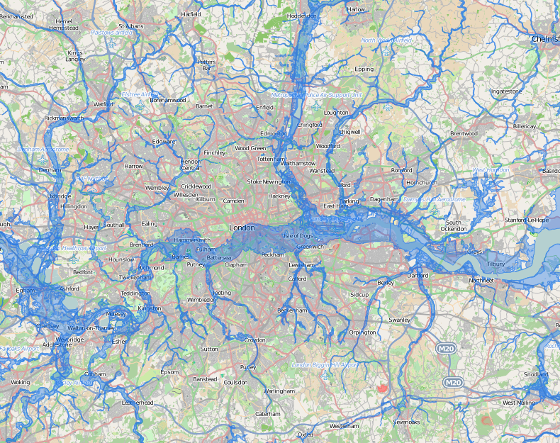
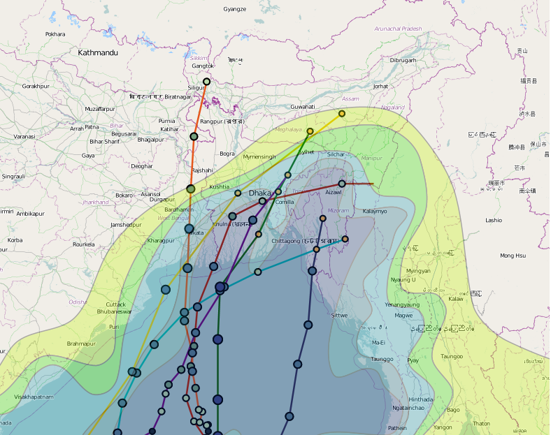
For example, climate and weather forecasts are available from decades to days ahead (although these vary in accuracy).  They can be used to issue ‘early warnings’ like the warning issued by the Met Office in the UK before the major storm on 27th October.

Map showing the projected average monthly precipitation for October by the 2080’s under the A2 SRES scenario (Source: Author’s own using CCAFS data/Hadgem1 Model)

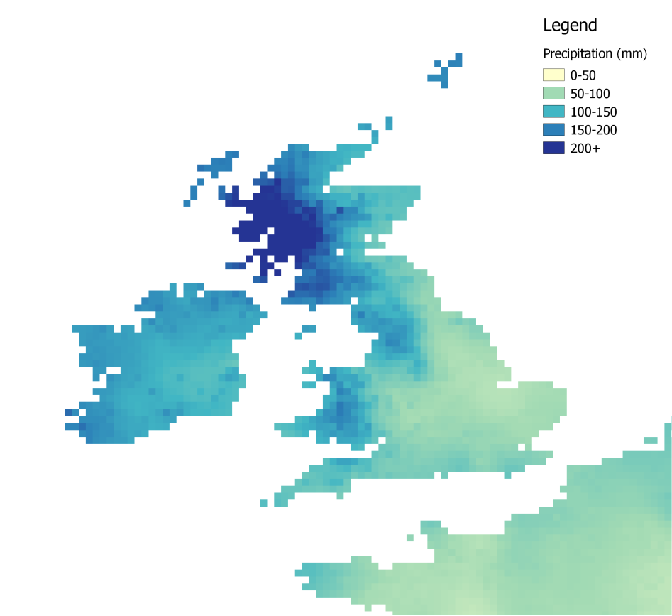
Climate change projections are available online from CCAFS and from the World Bank.

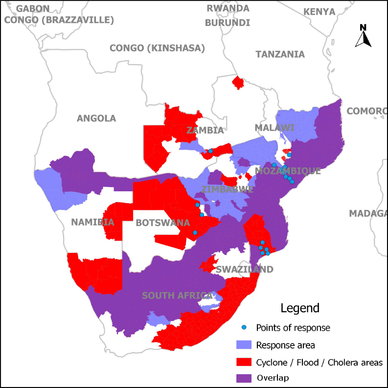
Disaster prevention and preparedness is aided by knowing where the vulnerable people and infrastructure are, and where disasters have happened in the past, so these areas can be targeted.


Maps help with disaster response and recovery

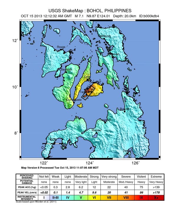
After a disaster, maps can help with relief and recovery.  Satellite imagery can be used assess the situation, and maps can be used to find the quickest route to an affected place.

Maps can also be used to assess loss and damage from a disaster, for example, in building damage assessments.

I have had an amazing experience working at the British Red Cross and learnt a lot.  It has been an insight into the great work done by the Red Cross, both abroad and in the UK, including all the staff and volunteers.  A massive thanks to everyone I met at British Red Cross!

The Fast-Paced World of Disaster Response

It has been a busy and exciting week here at the British Red Cross.

The week began with the earthquake in the Philippines.  A 7.1 magnitude earthquake hit Bohol, Philippines, close to the major city of Cebu.  The team were on hand to quickly draw information from multiple sources, including from the US Geographical Survey (below).

Earthquake in Bohol, Philippines, Source: USGS


What is a ‘Data Scramble’?

Rapidly drawing map information from many sources is useful to help the internal Red Cross response to a disaster.  This is known as a ‘data scramble’ and involves a team of several people all looking at different sources to gather information.

At the beginning of each emergency, various entities scramble looking for data sets to aid in their response. According to United Nations OCHA, it is beneficial to have these entities virtually coordinated during their respective scramble efforts so as to avoid duplications of efforts.

In this case, the team used a shared online document to upload information, which meant we were all quickly able to see the information that others had gathered.   In a disaster, information has to be provided rapidly, usually towards a deadline of 1 hour.

In the immediate aftermath of a disaster, there is a range of online mapping information which can be useful – including maps showing the impacts, population density, historical exposure, land use, and economic exposure.

It all goes to show that technology can be a vital tool for responding to disasters.

Once the task was completed, we did an analysis of the process to see where it could be improved next time, and gathered feedback from the team.  Guidelines are available online from agencies such as the UN.

Exposure to disasters is increasing

There is evidence that exposure to disasters increasing around the world, driven by forces such as population growth, deforestation and climate change (see the IPCC Special Report on Extreme Events).  Socio-economic factors interact with climatic factors to make people vulnerable.

This shows there needs to be greater international effort and attention on risk reduction, including forecasting, early warning systems, and long-term risk reduction including poverty reduction.

More to follow next week!


US Government Shutdown Prevents Access to Disaster Data

Using Data for Disaster Maps

In the second week of my placement at the British Red Cross, I have been helping to make a flooding map of Southern Africa.  We have been marking out the areas affected by flooding, cyclone and cholera in Southern Africa in the past 5 years (see below).  As I mentioned last week, the GIS team support the work of the Red Cross both here in the UK and abroad.

Map to show the areas in Southern Africa affected by flooding, cholera and cyclones in the past 5 years

The map is to help the logistics team decide where to put equipment warehouses containing non-food equipment for disaster relief.  Other factors to consider include access to transport links and the political context.

Challenges Accessing Data: US government shutdown

One major challenge this week has been accessing climate and weather data from US government websites.  This data is usually freely available online, but due to the ongoing political crisis in the US, some major government websites have been closed down.

The message showing on the NOAA website.

The NOAA (National Oceanic and Atmospheric Administration) website (above), for example, usually provides weather information, but the website is totally closed. Most websites from the US Geographical Survey (USGS) are also closed down, which usually provides information on natural hazards and earthquakes.  A message on the USGS website states: “Only web sites necessary to protect lives and property will be maintained.

What happens to early warning systems during a US government shutdown?

All this has made me wonder, what has happened to global disaster early warning systems during the US government shutdown? Are these early warning systems able to function properly?

Early warning systems are vital for early response before a disaster strikes.   Luckily, the ‘National Hurricane Center’ remained partially active during the threat of Hurricane Karen last week, and fortunately this hurricane was not serious in the end.  However, international weather data is not available that would usually be available, and it has been reported that these websites are understaffed.

It seems that the USGS earthquake feed is also not working at the moment.  Unless critical data is available, the US government shutdown could be not only inconvenient, but could also potentially endanger people’s lives.

Mapping Disasters at the British Red Cross

This week, I started my placement at the British Red Cross in London.  The GIS team play an important and vital role here in the work of the British Red Cross, providing map services to the other departments.

At the start of the week, I joined a corporate strategy meeting and found out about the seven fundamental principles that guide the work of the Red Cross, which include neutrality and impartiality. British Red Cross strategy is formed through an inclusive process of stakeholder engagement.

Back at the GIS team, I have been getting to know the British Red Cross mapping tools and systems. Geographic Information Systems (GIS) are a powerful tool that can be useful in humanitarian work.

Maps are useful in disaster and emergency situations to visualise affected areas and organise the allocation of humanitarian resources.  The GIS team here work closely with the national and international teams to provide any maps they need. For example, last week the team made a security map of Nairobi after the Westgate Mall terror attacks.

Map to show the track and intensity of cyclones in the Bay of Bengal (Source: Author’s own)

With an increase in climate-related disasters in recent years due to climate change, the Red Cross is also building up knowledge in use of climate and weather information in order to anticipate future disasters.

Overall, it has been a busy and exciting week and I am really excited about working here at the Red Cross.  …More to follow next week!