For blog #3, I wanted to talk about an graph or visualisation I’ve been working on, to help CDP display their data in a new way. It’s called a chord diagram, looks a bit like a spider’s web and is used to show the strength and range of interconnections in whatever system you are looking at, for example the total imports and exports between different countries (PLEASE click for interactive version-much more fun!). Source: http://www.delimited.io/2014/11/18/interactive-chord-diagrams-in-d3.
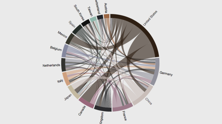
In short, segments around the edge of the circle represent components of the system you are looking at, in this case countries, lines that link two segments indicate a relationship between the segments, in this case a trade relationship, and the width of the lines shows the strength of the relationship, in this example the total imports and exports between countries.
So how is that applicable to CDP? In the CDP water questionnaire that goes out to the world’s biggest companies, one of the questions CDP asks of the responders is to identify the impacts and risks that water issues have or could have on their business. For example, a company might say that water scarcity in the region where they work has led to an increase in water prices and hence operating costs or that flooding has caused damage to one of their facilities. Companies identify a cause, the effect and how they have or will respond. It is important for CDP to understand the links that companies are making between these 3 elements, as this can make it clear why companies are feeling effects and how they are approaching impacts and risk. By understanding this, CDP can highlight good practice and propose ways in which companies can improve their water policy. And hence, we can use chord diagrams to illustrate the links that companies are making between cause and effect and risk and response.
By using this diagram, hopefully readers of CDP’s Global Water Report or visitors to the water results website can get a quick snapshot of the data and digest the statistics in a unique way that can capture the attention and resonate more than numbers would.
So I used my limited programming expertise I use in my PhD work at Imperial to make a little program that counts the links between cause and effect and risk and response, then put the results into a matrix, something that excel unfortunately can’t do with CDPs’ data. Then I found a makeshift excel workbook (try it yourself) that you can input your data into to make a very basic ‘my first chord diagram’. This was used as a proof of concept, to show what the diagrams can do. Hopefully we can go from my less-good looking excel version, to swanky interactive versions like these:
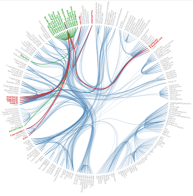
Uber journeys in San Francisco
SO COOL!
The feedback on the diagrams was really good, and they have been shared with other teams within CDP and could potentially be used with other data!
So I guess for prospective internship applicants I would say try to bring in your expertise to do things in a new way if possible, benefiting your organisation whilst also showing them what you can do. Don’t be afraid to give feedback about how things are done, I think a lot of organisations will appreciate an outside perspective. That has definitely been the case here at CDP, where everyone has supported suggestions and ideas.