A series of weekly blog entries inspired by my work at Sense About Science. This week: Infographics.
As a graphics designer I have worked on a range of tasks, from simple ones like making buttons for websites to designing print media for distribution and display. But rarely have I had the chance to bridge my scientific interest with my design hobby. On the one hand, this may be because visual design tends to take a back-seat for scientific media – the focus for design in likes of reports and posters are that of functionality and practicality. But there’s a more raw side to it; as engaging as it is to be perfectionist and pixel-perfect, it’s a rather alien concept to pair the abstraction of design with the concrete nature that are data and facts from scientific discovery.
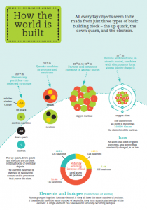
Those feelings, though, may be increasingly unfounded. While one shouldn’t expect brilliantly illustrated posters or artistically decorated journal articles anytime soon at conferences, initiatives in science communication have raced to take advantage of modern styles and conventions to better captivate their audiences. For instance, at the recent Royal Society’s Summer Exhibition, I was genuinely impressed by the lengths taken by some stalls to create brochures capable of bringing the science to life. Take a look at this excerpt from the material produced by the folks showcasing the Higgs Boson discovery:

I’ll admit it: aside from astronomy, physics haven’t captured my full interest since GCSE’s. Although I have harbored superficial intrigues as to fields such as particle physics – mainly due to their high research profile at Imperial – I do not understand them. Yet, coming out of reading the guide, I feel more confident about the basic elements. My knowledge has expanded – I know now how quarks fit in with the scales of our world, the foundations of matter/antimatter, and the basic principles of the Higgs Boson and Higgs field. The cartoonish graphics, brightened with a pastel palette, breaks down the highly complex topic into digestible chucks of appeal to a visual learner.
What the content of The Higgs Boson and Beyond illustrates is the increasing power of infographics. In a world increasingly reliant on social media and instant messaging, these hyper-visual ‘sight-bites’ can take advantage of our sharing culture, allowing skilled professionals like scientists to capture key information and data and disseminate it wide and far.
The argument can be made that such a method to communicate science may be ill-conceived. Breaking down science into tiny, digestible chunks may threaten the integrity of the information being communicated, as it wouldn’t present the full dimensions and nuances of scientific texts. Moreover, infographic production can be done by almost anyone, with or without science training. By combining a focus on visuals with a failure to present information appropriately, errorneous and/or exaggerated information can easily be fed to the public and gain great appeal.

Thankfully, such a phenomenon doesn’t seem to have developed (or at least, isn’t mainstream). It helps that so many science organizations and groups have jumped aboard the ‘infographics bandwagon’ in recent years. The high output of graphics, combined with a general appreciation of science from Internet communities, seem to have kept the flood of visual pseudo-science at bay. It also helps that proper infographics are not something that can be made easily in one’s average word processor, and follows strict guidelines. True infographics are ultimately about the accurate portrayal of data and evidence, not to act as decorations to a document. It stands to reason that accurate infographics require more care and attention, perhaps through commissioning professional designers, who would be more readily able to produce quality products. These, in turn, would sport better aesthetics and hence be more captivating and readily disseminated.

Returning to Sense About Science, one of the main challenges during my 4-week internship would be to try and create infographics based on the charity’s Making sense of… guides, for sharing on social media both to regularly inform followers and potentially be used as a promotional tool. Having never made an infographic before, this is proving to be a thrilling yet daunting challenge. The points discussed above would set a basic framework which I trust will inform my work in the weeks ahead. to set down a basic framework which I trust will inform my work in the weeks ahead.
(As of the time of posting, 2 infographics have been drafted for Sense About Science. Once these are approved, they will be posted as part of my Xth Day series)
Next: Tenth Day. Then: Dissecting Pt. 2